
When brands move into large-scale apparel production, they often want to include sophisticated visuals – like smooth gradients, subtle shadows, or fade effects. These details can elevate a design, but they also expose the limits of certain printing techniques. Understanding what’s possible (and what’s not) is essential if you’re using digital garment printing at scale.
At In‑Credible, we receive regular inquiries from brands asking whether their gradient-heavy artworks will hold up in bulk print runs. Some methods work flawlessly, while others struggle – even on high-end equipment. This article shares our perspective on the capabilities and technical limitations of current garment printing technologies, so you can make informed choices from design to delivery.
What Makes Gradients and Shadows Challenging in Digital Garment Printing?
First, let’s be honest: not every print technology handles color transitions or soft shading well. Why? It comes down to how the image is rendered onto the fabric, the level of detail permitted by the RIP (Raster Image Processor), and the way ink interacts with the material.
For instance, Direct-to-Garment methods vary. The faster, cheaper “wet-on-wet” DTG printers (common in many print-on-demand operations) often struggle with gradients that fade into transparency. As reported by experienced operators:
This method cannot print gradient to transparency (i.e. fades, glows, and drop shadows) well.
Higher-quality “wet-on-dry” DTG, however, is capable of cleaner transitions if the file is prepared correctly. But not every supplier uses this setup – so the printer you choose matters.

What Digital Garment Printing Does Well
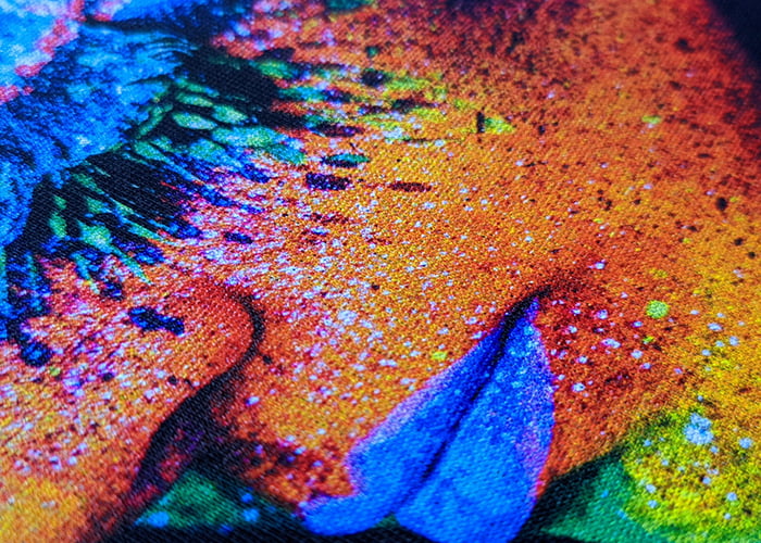
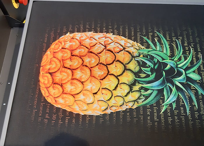
Digital garment printing using high-end DTG or DTF technology can accurately reproduce full-color artworks, including smooth gradients, subtle shadows, and intricate text details. This method particularly excels when it comes to rendering photorealistic images, handling seamless color transitions, and preserving mid-tone shading.
If your brand frequently works with complex graphics or photographic designs, this modern printing technique offers outstanding image fidelity – especially on cotton and polyester-based fabrics.

Where Digital Printing Falls Short
Despite the advantages, digital printing still has limitations:
1. Transparent gradient edges
Not all printers support fade-to-clear effects reliably. On lower-end DTG systems, the RIP may automatically apply a white underbase behind every pixel, ruining the fade.
2. Tiny highlight transitions
Subtle transitions at 1–3% halftone levels may lose clarity unless the printer can render extremely fine detail – something not all RIPs or printheads can handle.
3. Unpredictable color shift on dark garments
Dark fabric, mesh, or athletic blends can affect how gradients appear, resulting in glow halos or banding unless handled by specialized hybrid techniques or DTF.
When Hybrid Printing Comes Into Play
Enter hybrid printing, which blends screen printing’s strength in opaque underbases with digital precision on top. The hybrid process works like this:
- Screen print a white or opaque base layer
- Digitally print the gradient or shadow image over it
This method combines punchy color fidelity, sharper transition control, and flexibility for multi-color or photo-quality designs. It also handles ring-spun cotton, blends, or dark materials with fewer issues.
According to commercial hybrid print experts, hybrid printing “excels at full‑color graphics, photo prints, illustrations with gradients” and is often faster and more durable on volume print runs.


What That Means for Brands & Designers
If your designs include fading, glow effects, or long tonal gradients, the first step is to carefully evaluate your production method. Standard DTG printing may pose risks, especially when it comes to handling transparency fades or capturing ultra-fine shadow details, which can result in inconsistent results.
Wet-on-dry DTG can be a workable option, but only if your printer is equipped with high-resolution RIP software that can handle detailed tonal transitions. For the most reliable outcome – particularly at scale – hybrid printing tends to deliver the best combination of precision, consistency, and scalability when working with gradient-heavy designs.
How to Set Up Your Artwork for Success
When working with designs that include gradients or shadow effects, it’s important to follow a few best practices to avoid surprises in production.
First, always export your files at a high resolution – ideally between 300 to 600 DPI – and use the correct color profile (CMYK or RGB, depending on printer requirements).
Avoid using hard transparency without a gradual fade, as this can cause abrupt edges or unintended artifacts in print. It’s also crucial to test whether your printer’s RIP software supports fade-to-clear masking, especially for soft tonal transitions.
Before scaling up, create a sample or pilot print to visually confirm that the shading renders as expected.
Finally, communicate with your print provider and request their file template. This ensures your artwork aligns with their tonal transition limits and equipment capabilities, leading to a smoother production process and better print outcomes.
Final Thoughts
Digital garment printing provides the flexibility and color fidelity brands need today – but not all setups handle gradient effects gracefully. If you’re working with sophisticated visuals, understanding the technical limits of your printer is crucial. Hybrid printing bridges many gaps, especially at scale, offering precision where pure digital methods may falter.
Want to include premium-quality gradients or shadow details in your next print collection? Give us a design sample – we’ll walk you through the best method to match your artwork to the right print process.